
Design System in Figma
- Role: Project Lead
- Duration: 3 months
- Year: 2020
- Collaborations: Design Systems team, Head of Design, Director of Product Design, Developers, Product Designers
Goal
Figma is a collaborative design tool that gives individuals and teams a better way to design. When investigating the Sketch libraries, I discovered that we had a lot of inconsistencies. I counted over a dozen different buttons with varying sizes and color, and even more frustrating than that, when looking at the designs, the majority of the components were detached due to the lack of variants. Our approach was not the best approach for a design system, so I had to come up with a better solution.
Problem - We severely lacked consistency across the whole app
As I began to dissect the pages of both Bumble and Badoo, I realised that we severely lacked consistency across the whole app. Instead of a repeatable method for building pages and a library with reusable elements, designers and developers were coming up with their own systems and creating brand new solutions, many of which were very similar, though not exact, to solutions already implemented in production. Not only was the design system difficult to maintain and update, but it felt inconsistent for everyone.
A 'Modal' component names ‘Card’ and an 'Action Sheet' component named ‘Modal’
I wanted to make sure that the components we have in production are added properly in Figma, supporting all the variants. I wanted to make things simple, and make sure that developers can reference colors, typestyles, and components properly with less input from the designers.
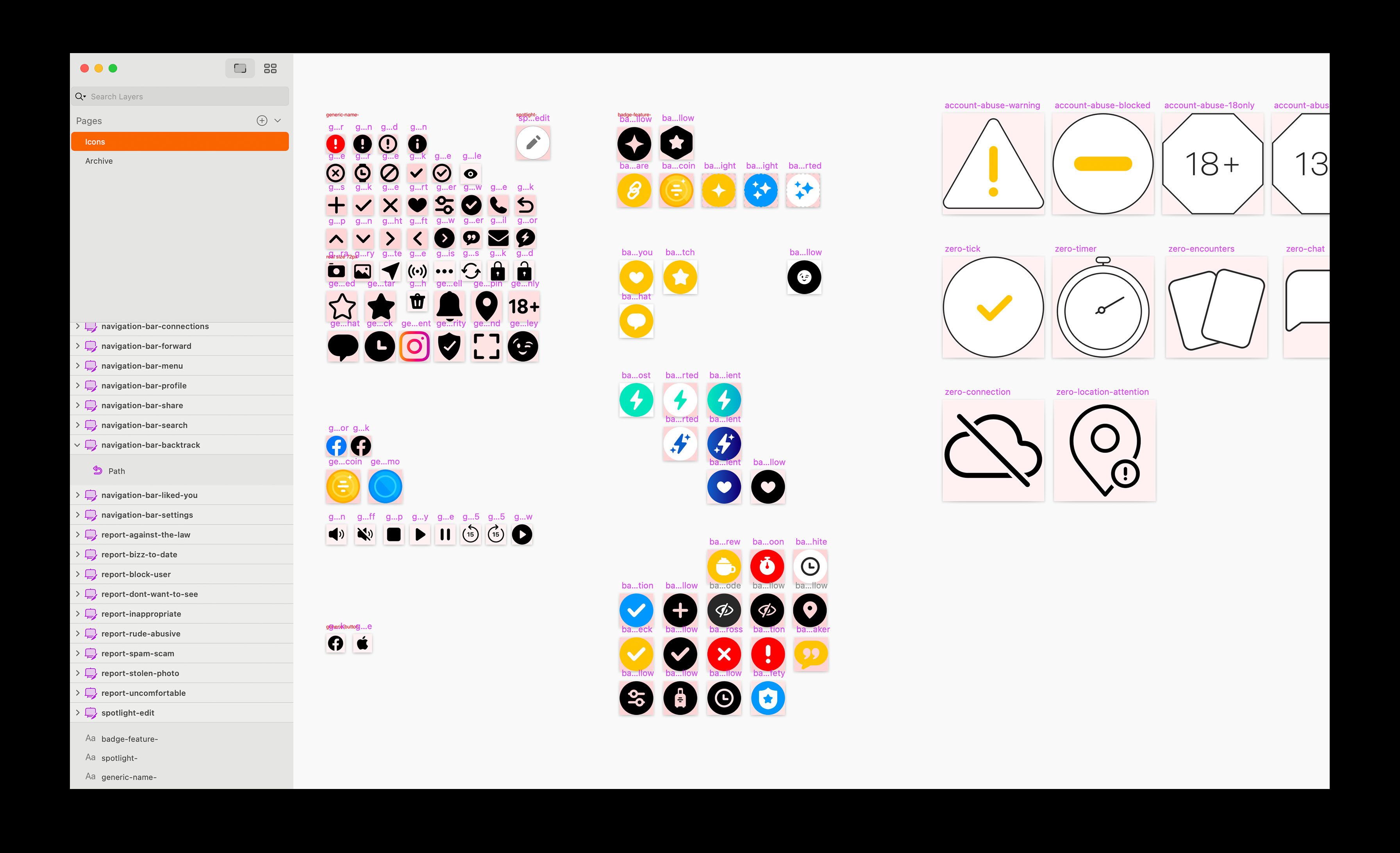
Another big issue we had was with the asset libraries. We had a lot of inconsistencies. The client library, especially, had a lot of different sizes, styles and repeated icons.

Blank Canvas
Due to all the issues listed above, the plan was to start from a blank canvas. Decisions at every scale define the user experience—from layer names to component structure. I wanted to have the UI kit inform the design files as a pixel-perfect standard to match what we have in production. Maintaining high quality at every level of a design system was my goal. I started off by fixing the core components. These include the colors, typography, and assets. I made sure that all of these styles are using the same naming convention we have in Cosmos.
Styles
We introduced Feature Colors. These are colors that are used to identify one or more specific tint(s) used in Badoo and Bumble. These colors generally are nothing more than aliases of the basic palette of colors used in the application, but are still considered and defined as semantically independent entities.
In the image below, the "primary" color and the "premium" color may share the same hex value, but are considered different colors, and used alternatively depending on the context: eg. in a generic screen where we show a generic button, the button may be "primary", but in a screen where we are promoting the paid feature, we show a "premium" colored button.
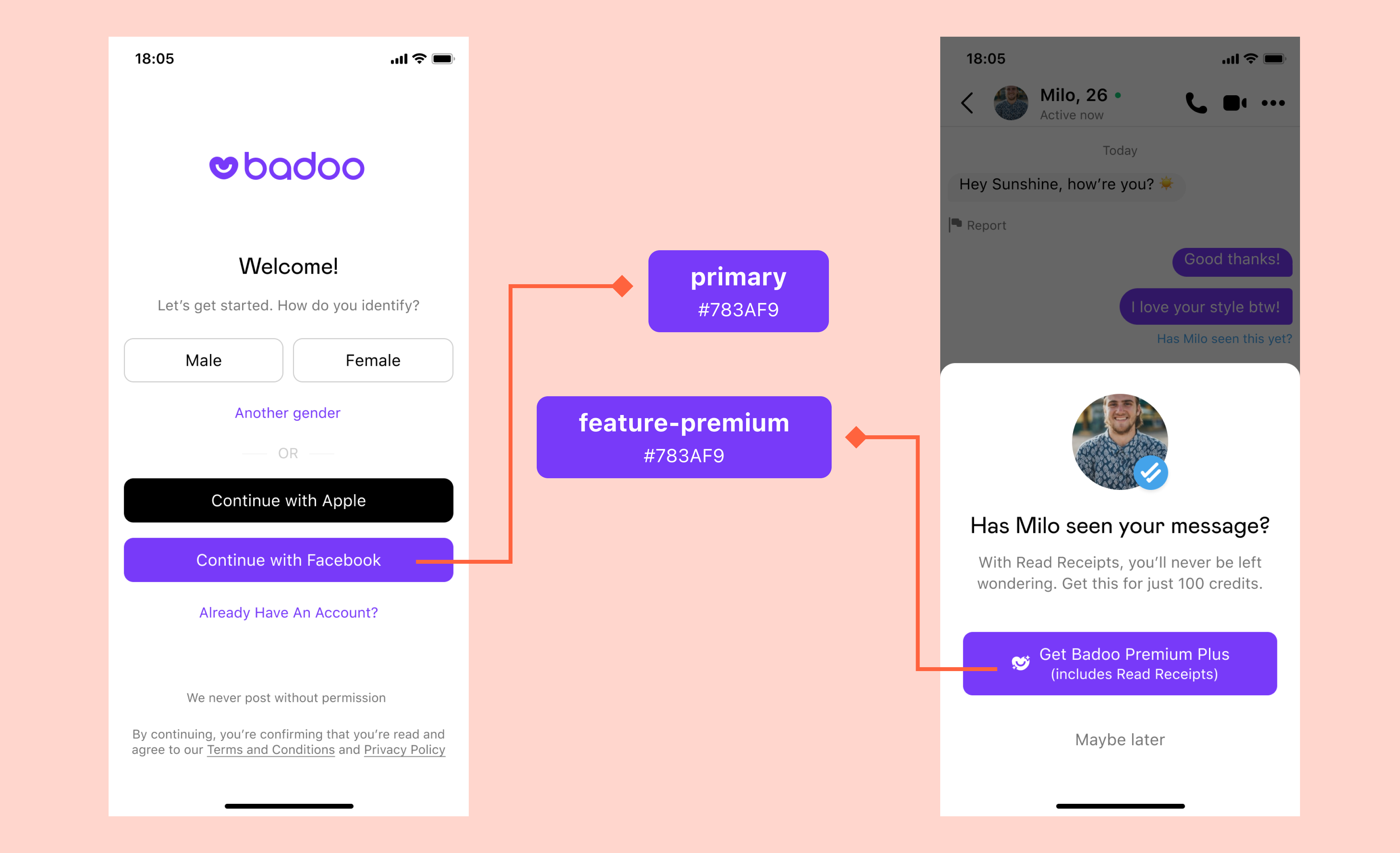
'premium' and 'feature-premium' sharing the same hex value
Following this principle, the final result in terms of colors in Figma was that from a limited palette of raw colors, we define a set of colors for brand, feature, generic, social, and others.
The reason why we make use of "feature colors" is because this way we can change colors related to specific features across the entire application without requiring any extra work from designers (eg. updating all the Figma files) or developers (eg. going through all the pages/codebase and manually checking which colors to update).
When it comes to typography styles, we encountered no issues or complexities here. Styles were easily added in Figma.
Asset Libraries
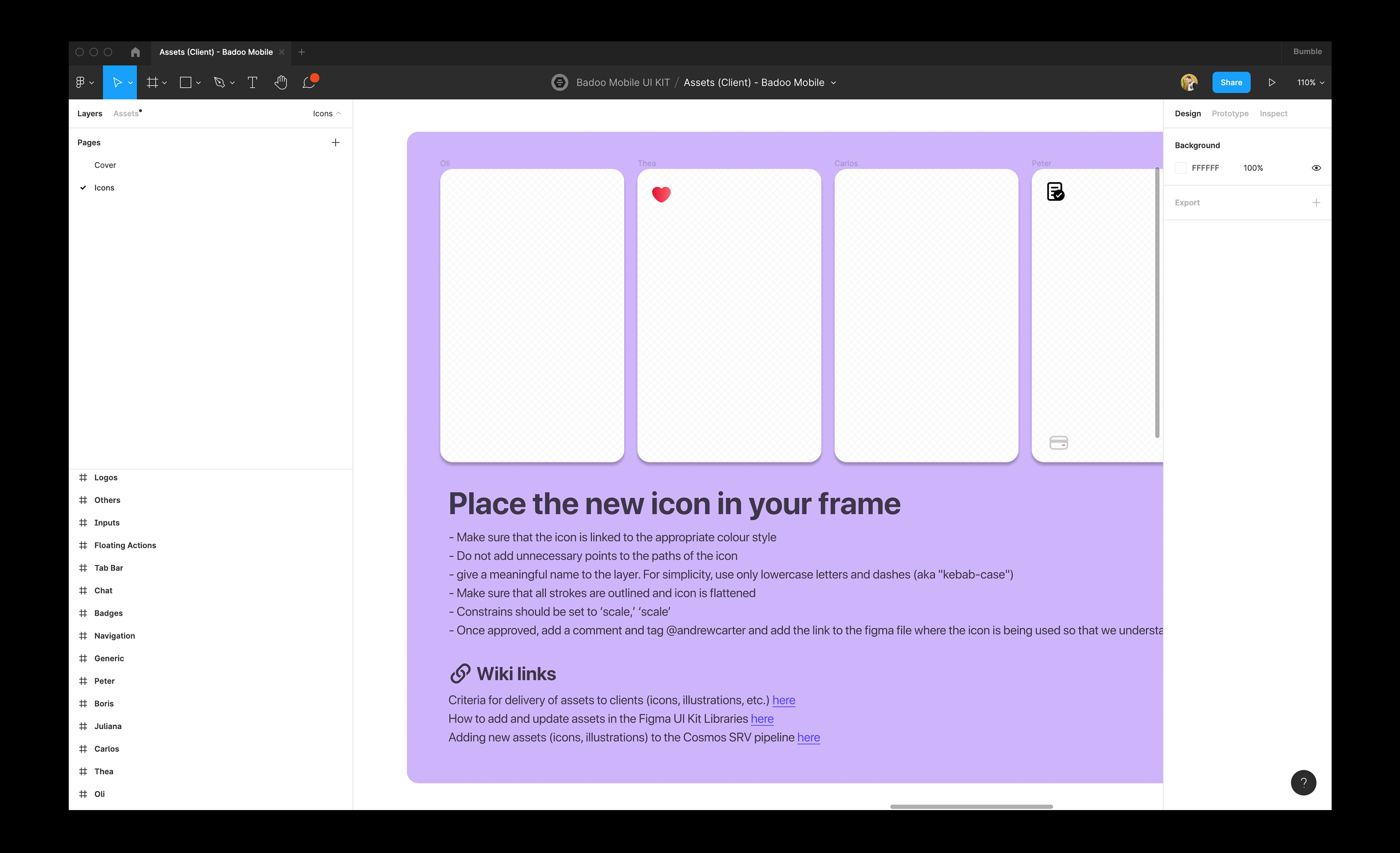
All the assets, both client-side and SRV side, are stored in separate Figma files. Assets distribution has always been a painful task for both designer and developers. I have noticed that adding new assets was very common, and the team was adapting a manual approach in adding new assets. This resulted in having a library with a lot of inconsistencies in sizes and naming.
I wanted to adopt a new process for adding new assets. In both libraries, each designer will have a frame with his/her name that allows them to add the asset they need in their frame. The asset will be created as a component, and used as an instance in their designs. This allows them to keep designing without having to replace all the icons once the asset is officially added to the library. This allows everyone to be aware that the asset is still under consideration and still needs to be approved. I have also added documentation on how new and updated assets should be added.
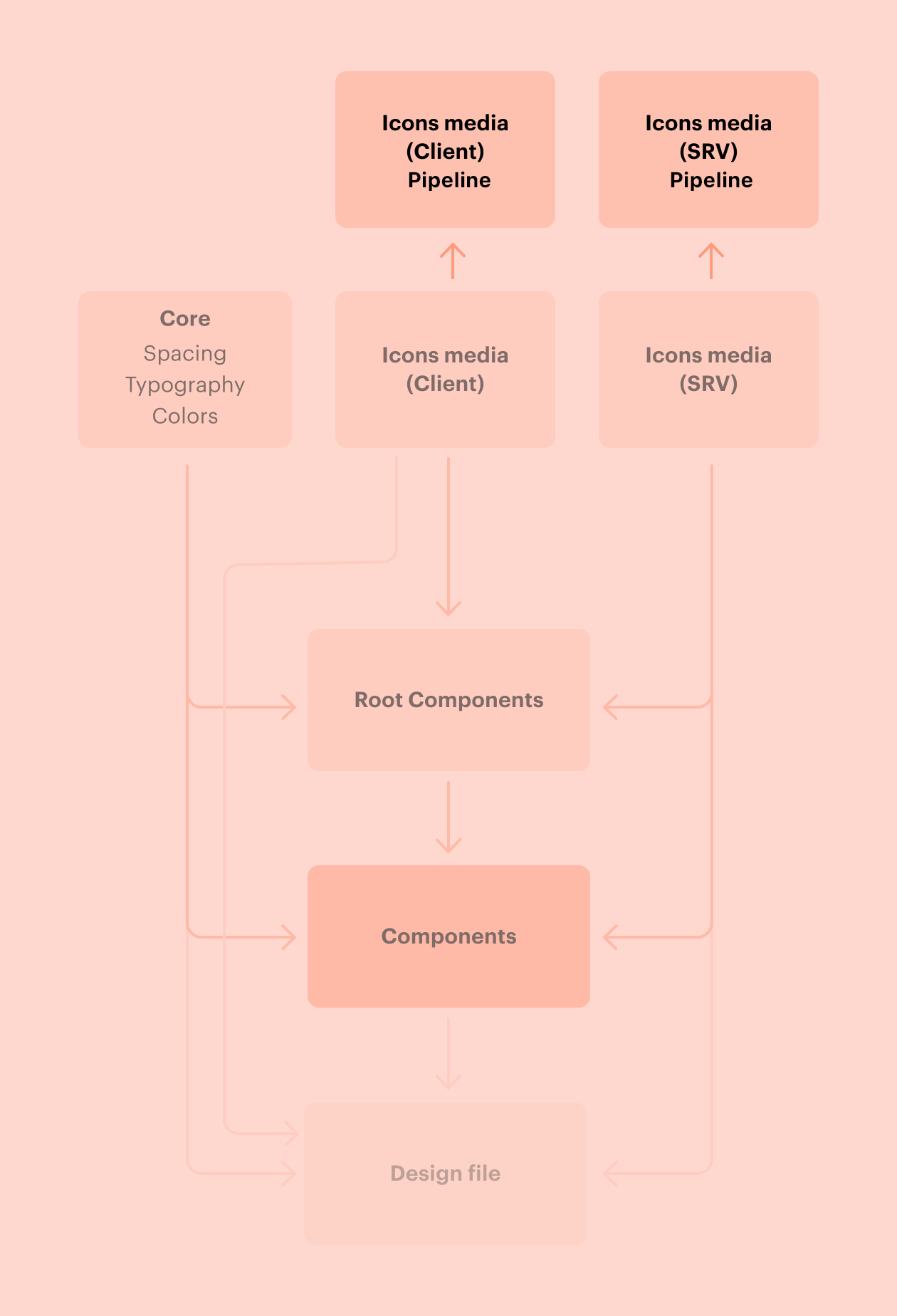
From the development side, we have a duplicate of these two libraries which are managed by the Cosmos team only. Whenever there is a change in these files, the new or updated icon is manually added by myself and the assets will be regenerated via the custom build plugin. This plugin, used by developers, allows assets to be retrieved by the Cosmos pipeline CLI/scripts.
For the first few months, we imported the icons with the same sizes. The reason for this was that we knew that we were going to redesign the icons and that we should treat the asset libraries as a separate project due to the complexities during the process of migrating. This is how the icon library ended up.
Icon Scale
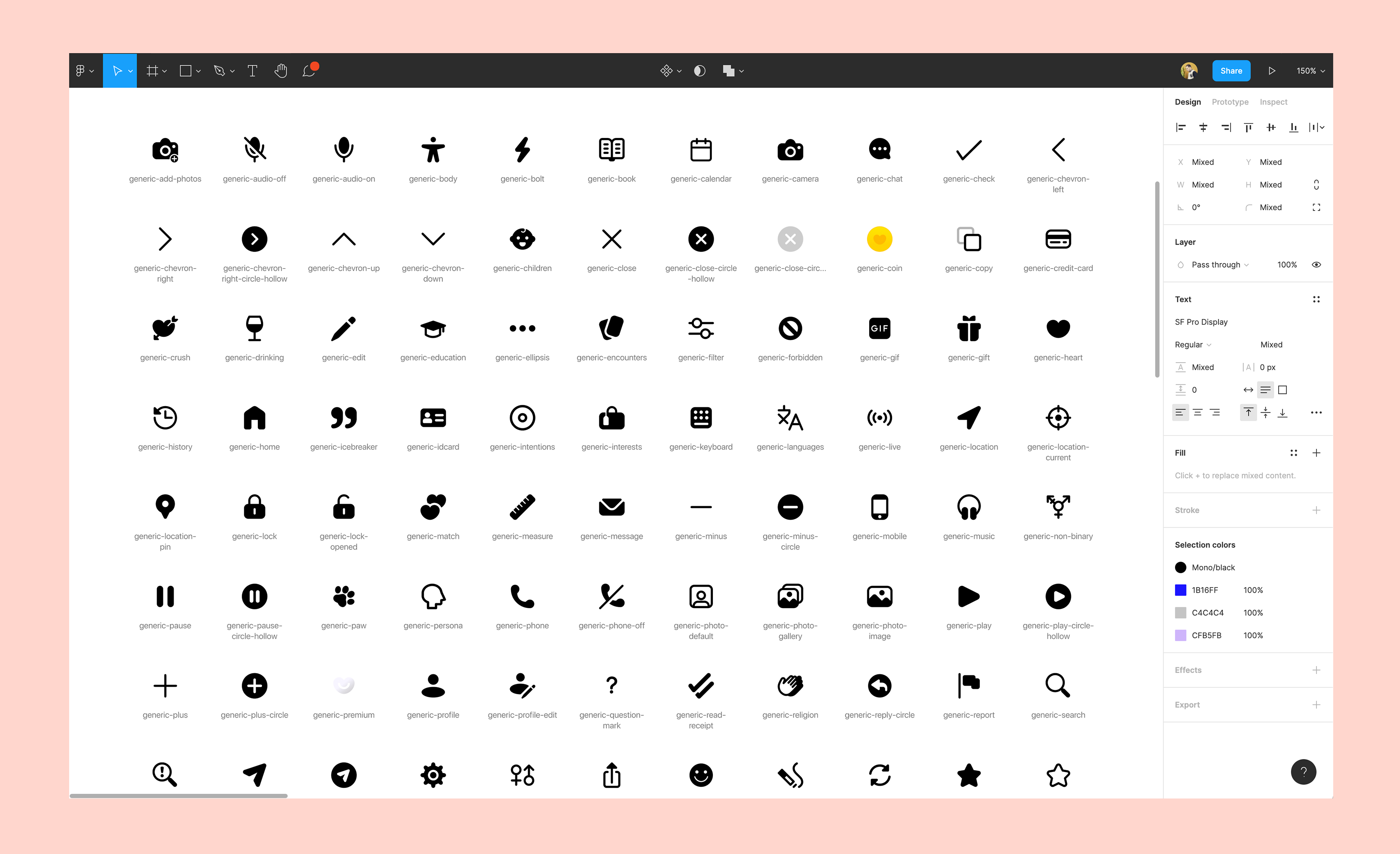
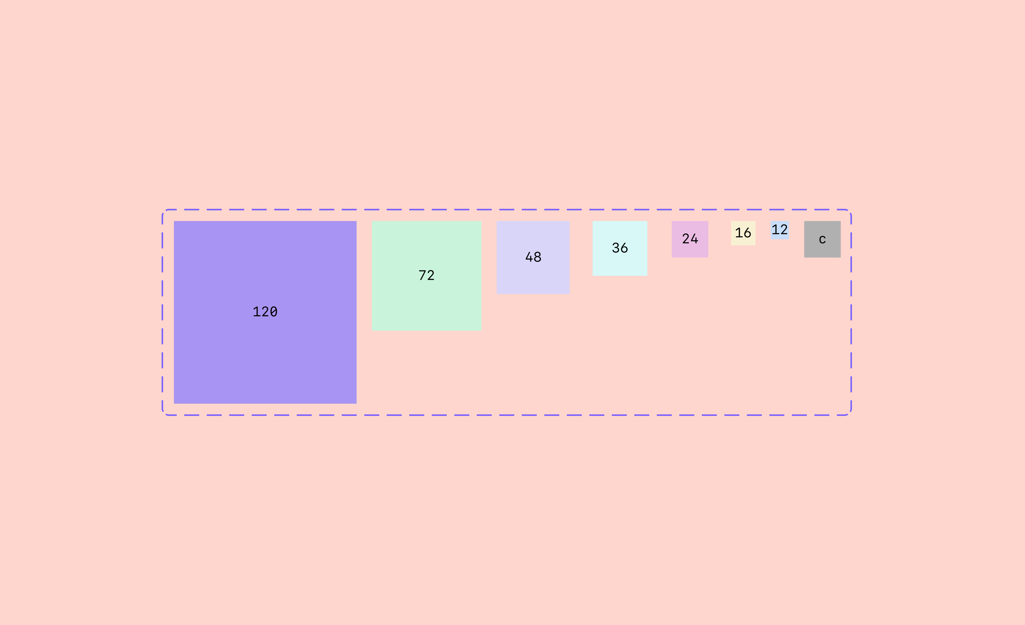
In Figma, it is not possible to change an icon size inside an instance, unless replaced with a different component. Since all icons are using 24x24 scale in the library, I created the icon scale which allows designers to; use a specific scale and not use random icon sizes, and change the size from the component instance.
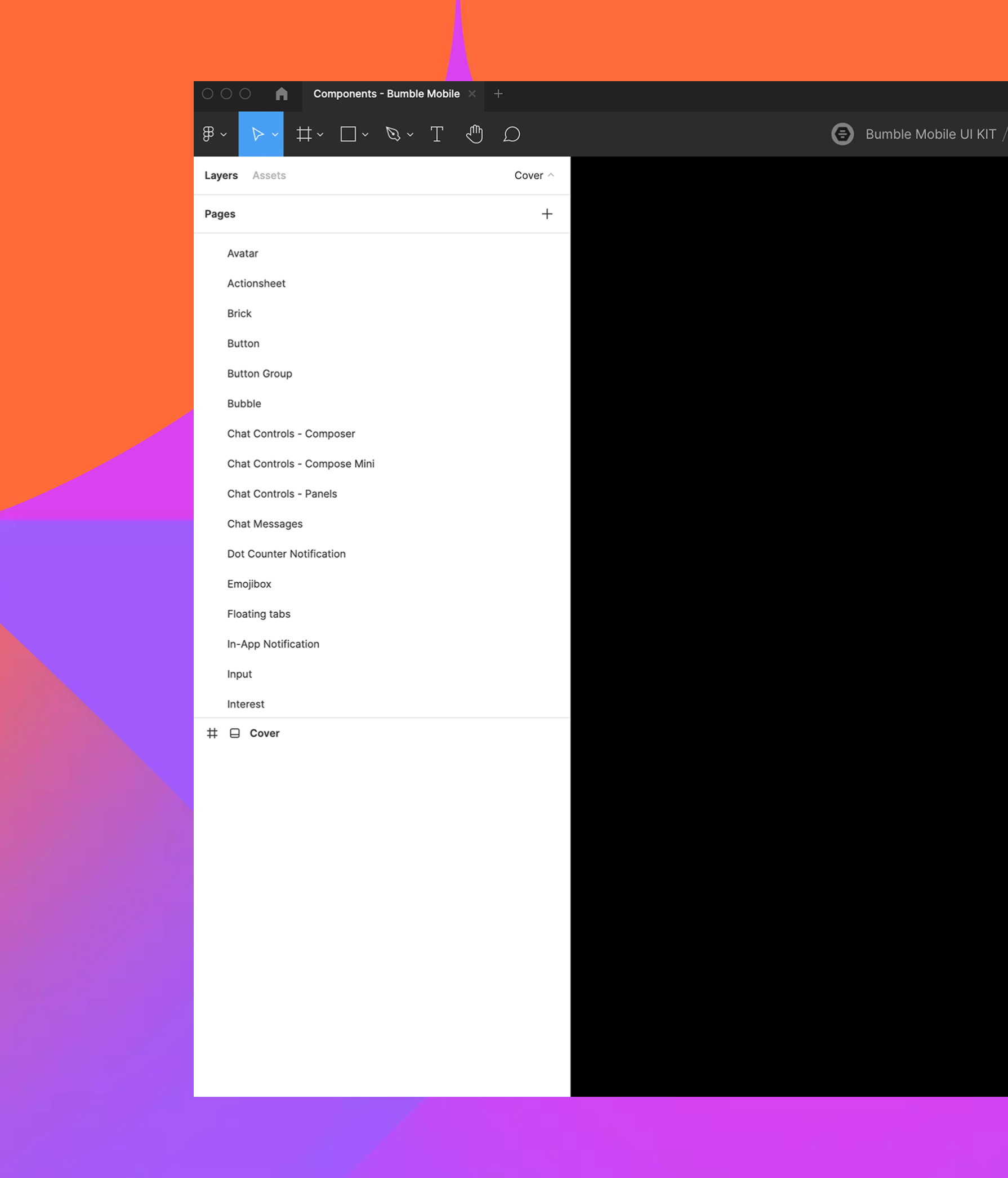
Building Components
The next step was to start building components in the Root file. The purpose of this file is to be accessed and maintained only by the Cosmos team and acts as the single source of truth for all the components. All instances and variants are then placed in the Component Library to be accessed by designers. Refer to the visual reference above for the structure of the libraries of both products (Bumble and Badoo).
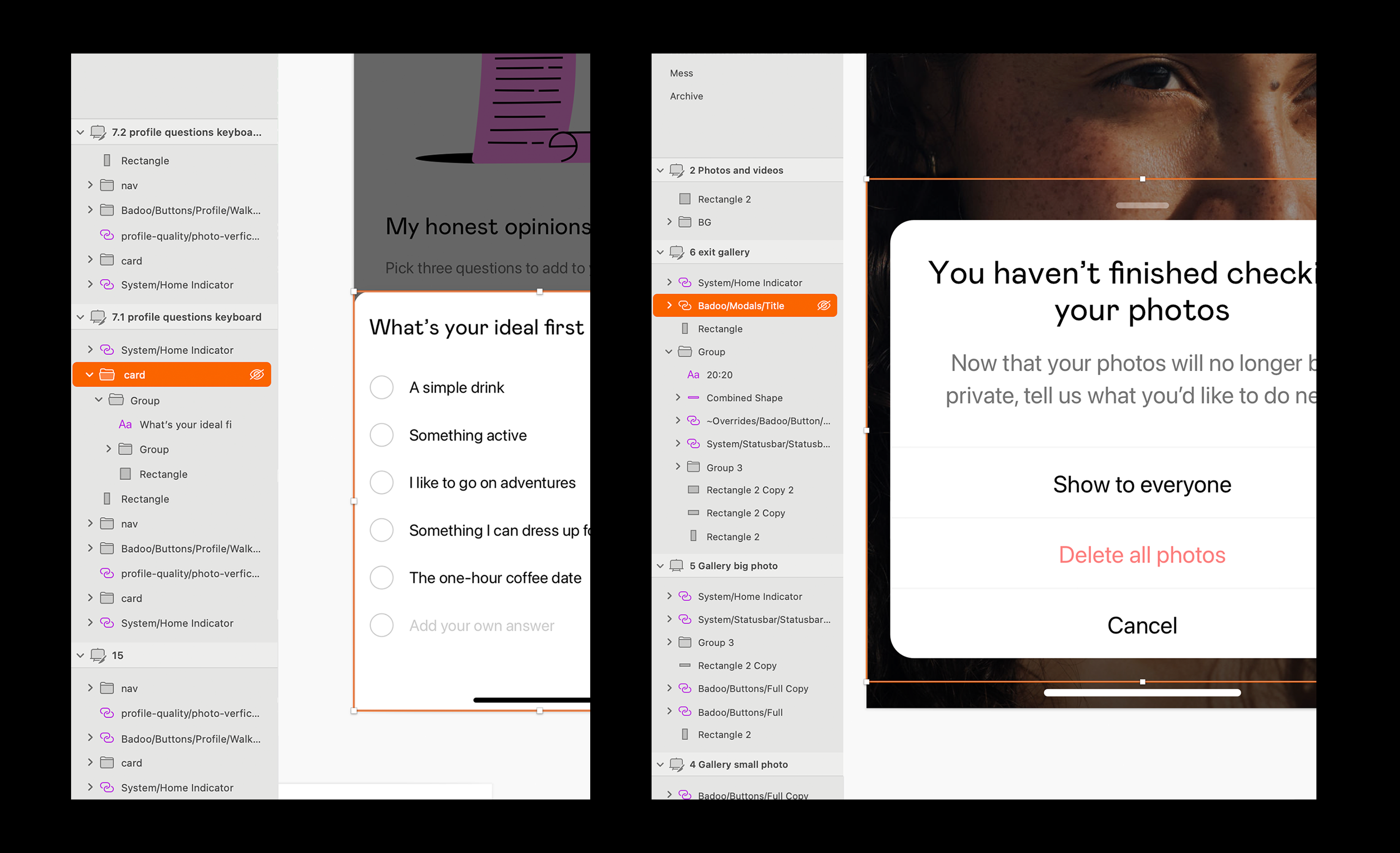
Sketch components were not consistent, missing, and not inline with what we had in production. We had so many issues that it required time, effort, and planning to solve all of them, but it was worth the effort because it helped with providing detailed components to the team. It also helped increase the overall design consistency and made the maintenance easier in the long run.
As illustrated in the images below, all the components properties were inline with what we had in Cosmos (production).


Placeholders
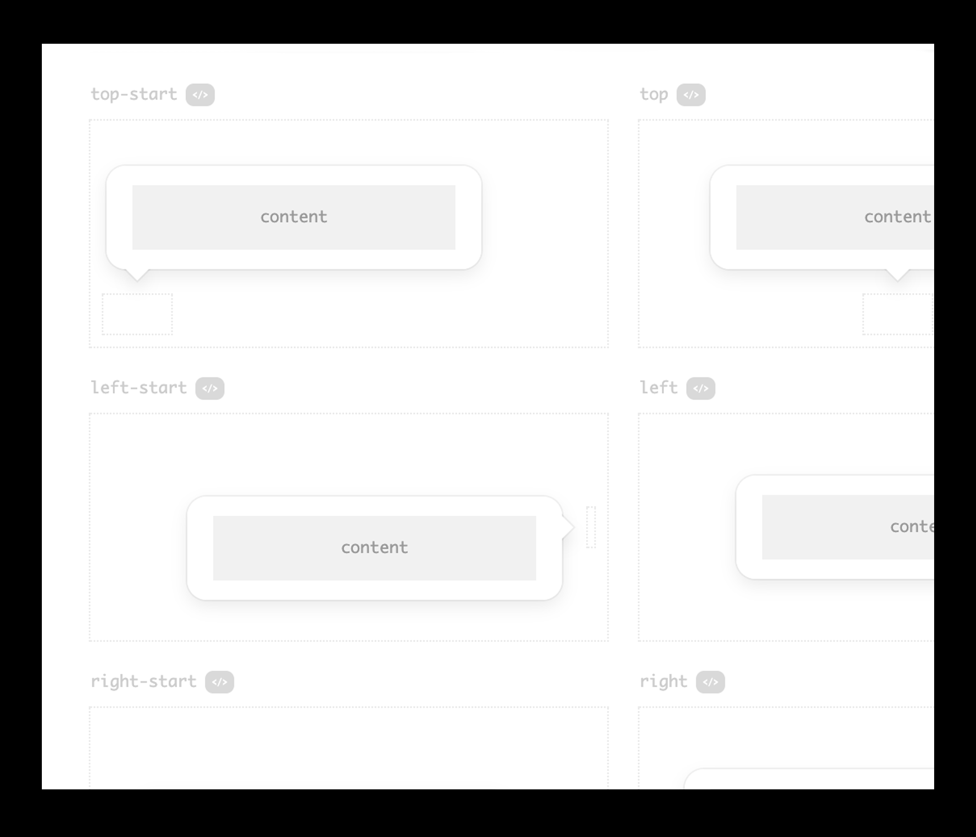
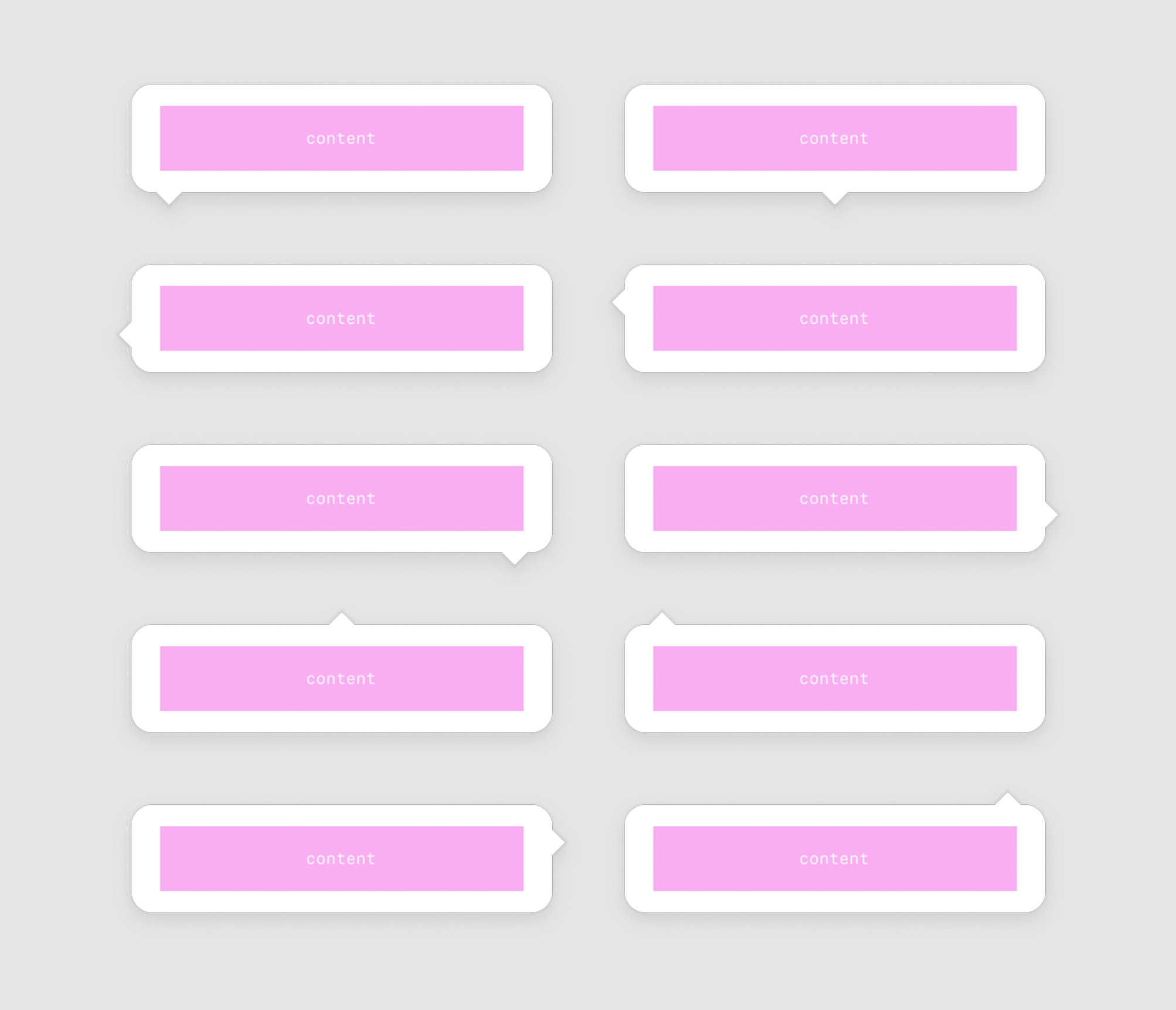
We can’t always assume what content a designer wants to place in a component. In the example below, one can notice that the tooltip can contain any content inside it, and not just text. Same goes with other components, such as the Modal.
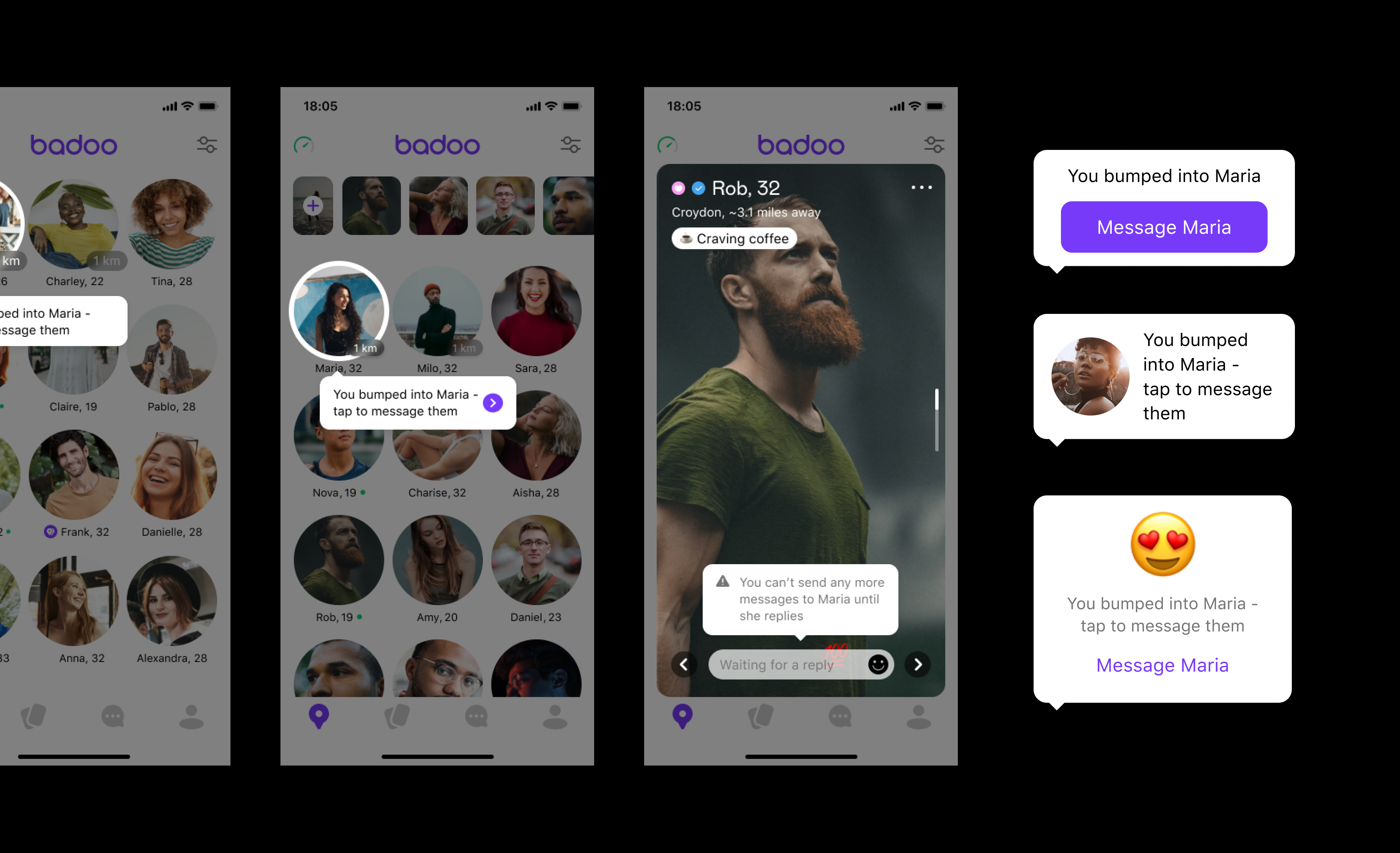
With the help of auto layout, I was able to achieve the same replication we have in Cosmos. Designers are now able to replace the placeholder with a local component, while still making use of the component in the design system and have one single control point for the component. In most cases I have added most commonly used variants as components as well.
To make the designers’ life easier, I have added variants that are most commonly used alongside the placeholder variant. In the tooltip example, designers also have the option to add a basic tooltip with text only, which based on the Figma analytics data, it is the most commonly used variant.
Testing Phase and Learnings
The above process was first tested with Badoo and implemented to Bumble afterwards. This allowed us to identify issues and avoid repeating mistakes to both products. From Badoo’s design system I realised that due to making sure that components are 100% aligned with what we have in production, sometimes components were quite complex to use. This was then taken into consideration for Bumble.
We have also invested time into building documentation and 'how to videos' to educate the designers and engineers. This turned out to be a hit and definitely softened the blow for people who were perhaps a little hesitant about the move to Figma at first.
Outcome
Designers are really happy with what the Cosmos team has managed to achieve. We managed to save designers’ time from working on design breakdowns as the new design system in Figma allows developers to inspect the file properly. Life is much easier for both developers and designers. There’s still more work to be done, but product teams are now buying into the system and reporting real benefits. It’s great to know we’ve built a solid foundation to scale from.
Related case study: Migrating from Sketch to Figma
Related case study: Chat Design System
Lokalise interview: The magic of Figma: use cases you wouldn’t expect
