
Chat Design System
- Role: Project Lead
- Duration: 3 weeks
- Year: 2020
- Collaborations: Design Systems team
Goal
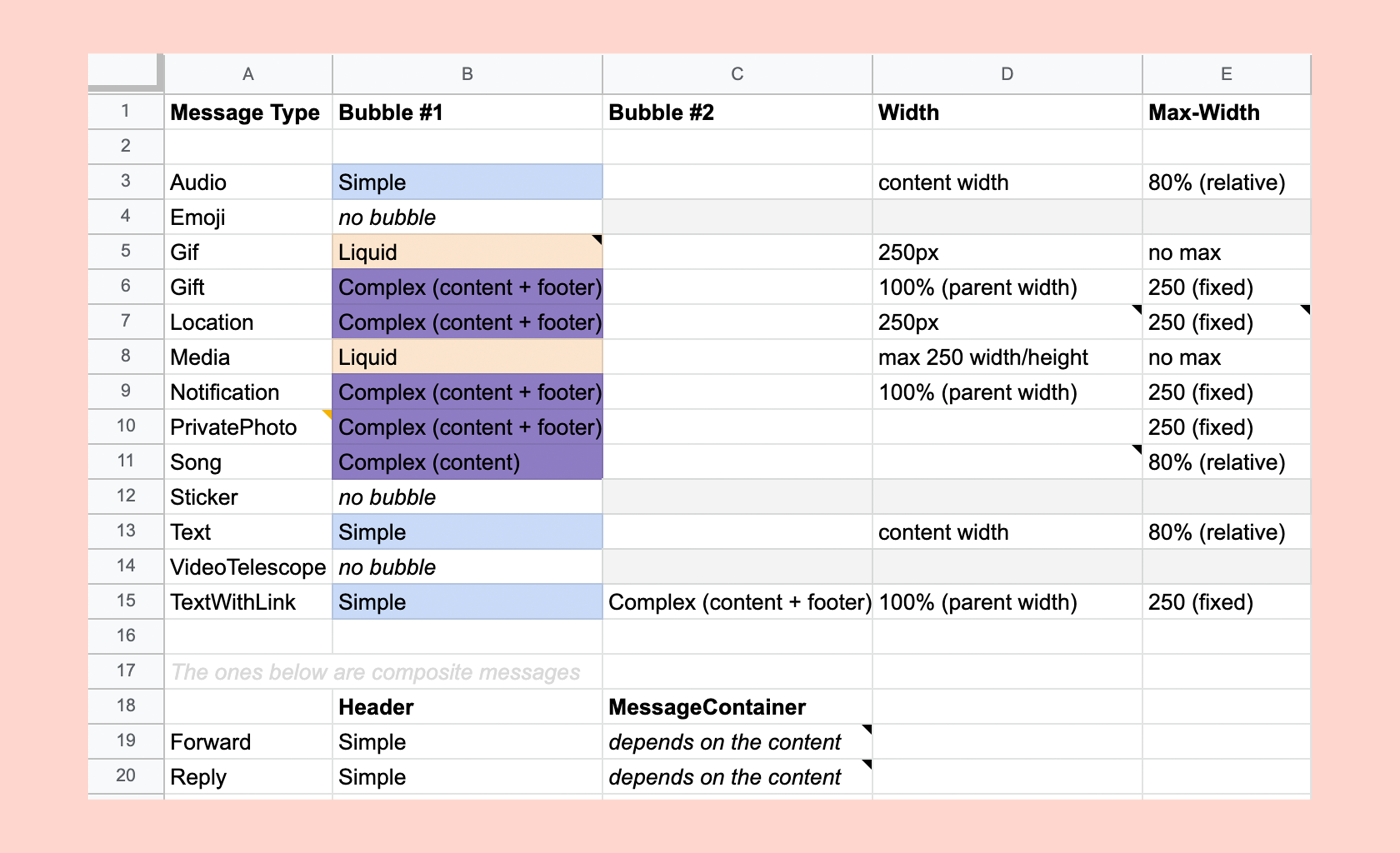
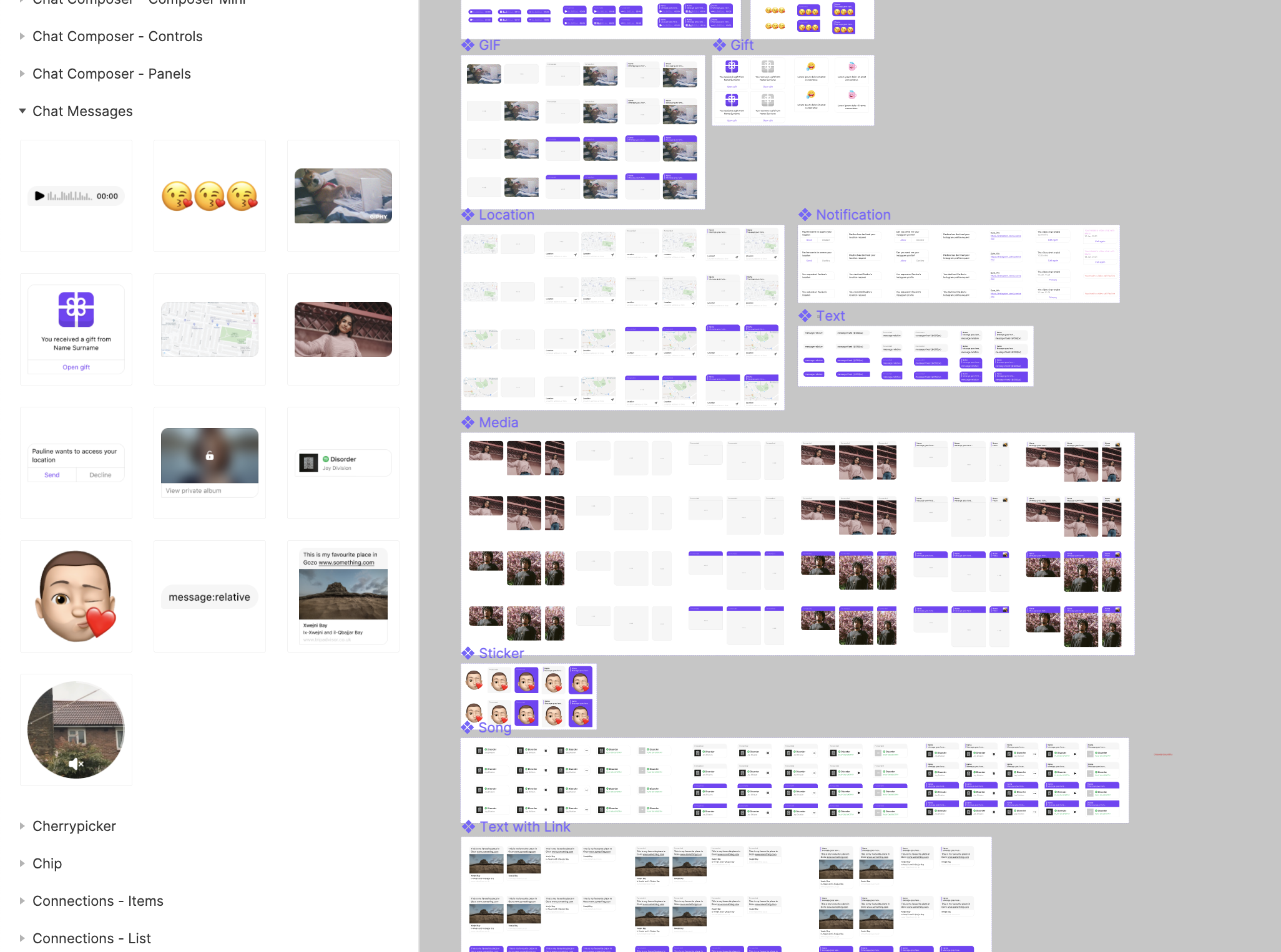
The chat component is one of the most complex components we have in the design system. In fact, even though all components are placed in the same library, we treat the chat like a design system of its own. The chat component comprises hundreds of variants. In total, if we gather all the variants, we would end up with more than 400 message variants.
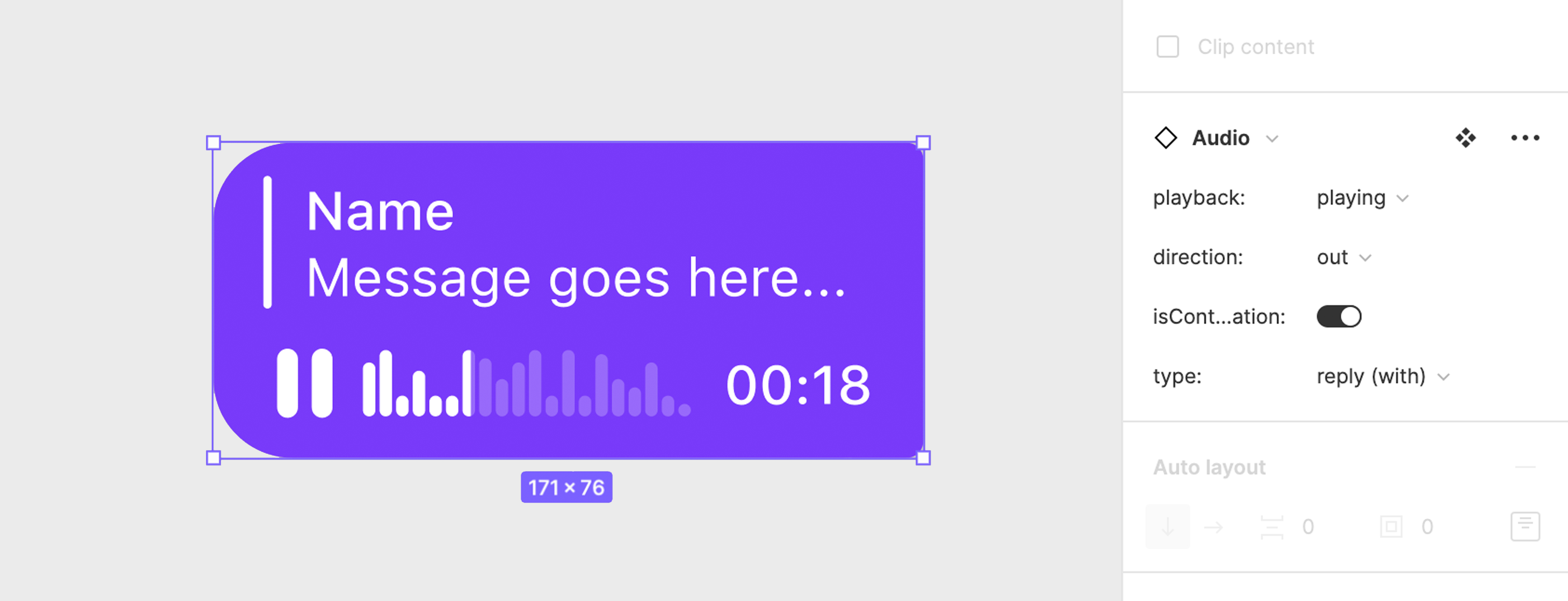
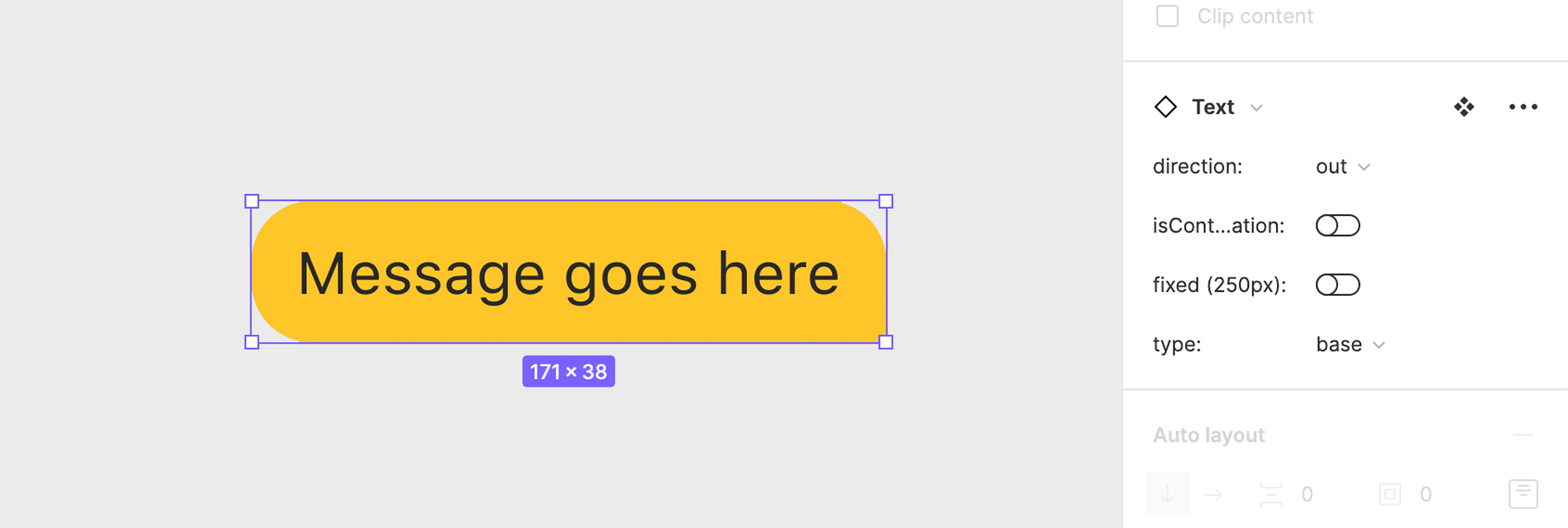
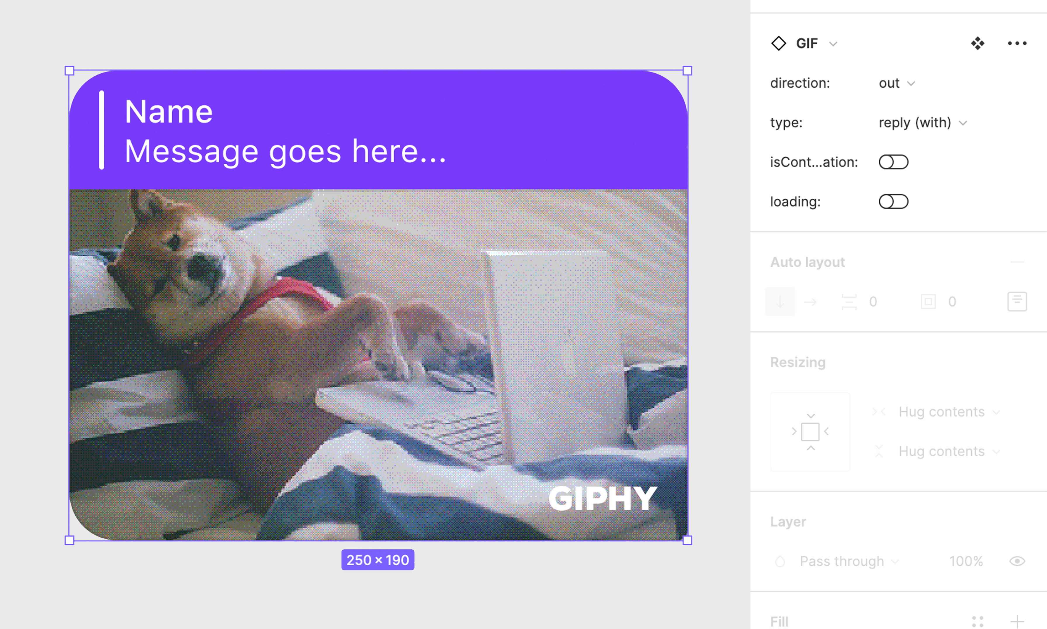
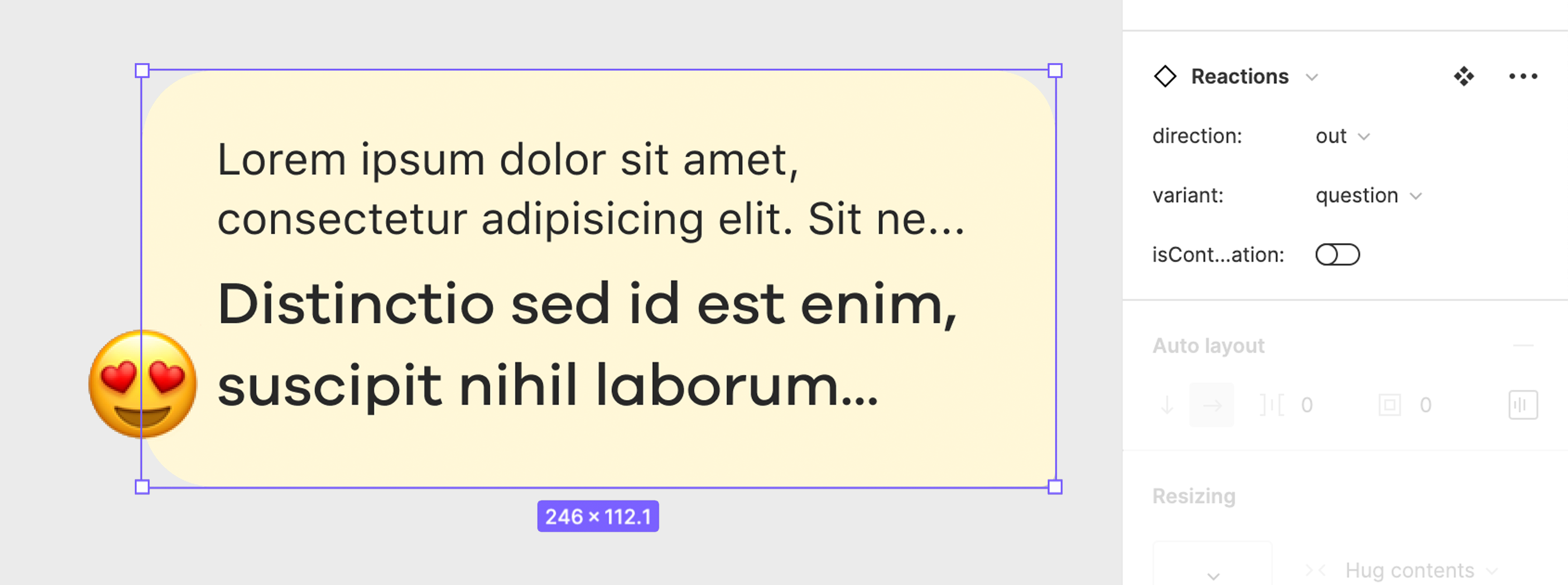
Messages can be text, media, song, gift, voice, emoji and a bunch of other types. All these types of message can either be an incoming message or an outgoing message which both use different colours. The message can be a base message, but it can also be a continuous message. The message can also be a reply or a forward message, and to add to the complexity, chat messages can have a status or a reaction.
The goal was to improve the collaboration between designers and developers and make sure designers have all the chat variants available to them.
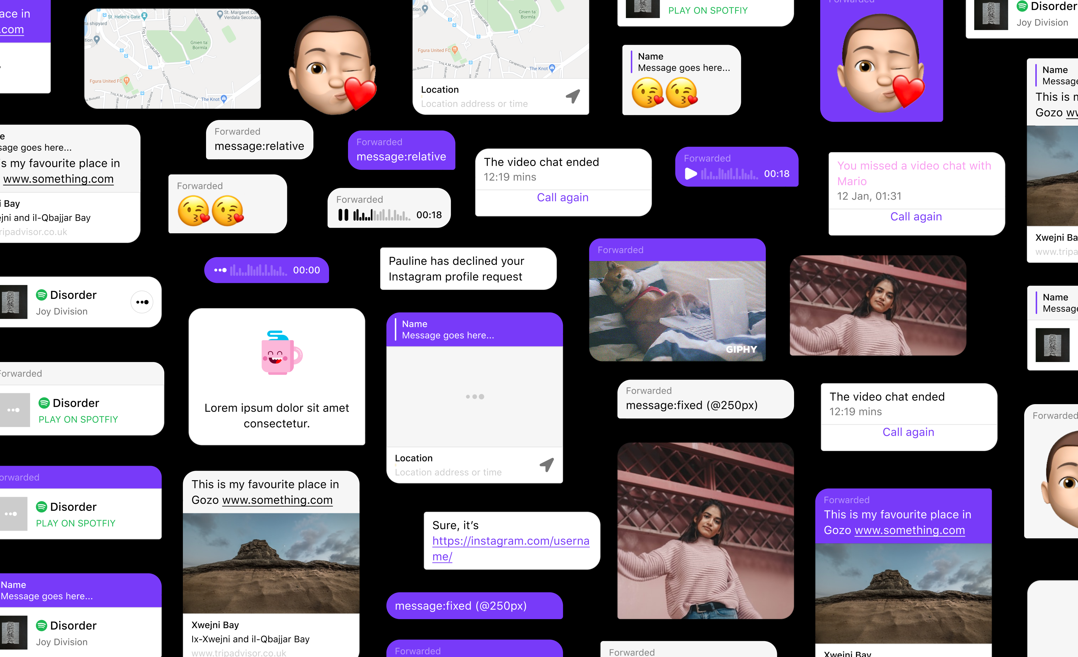
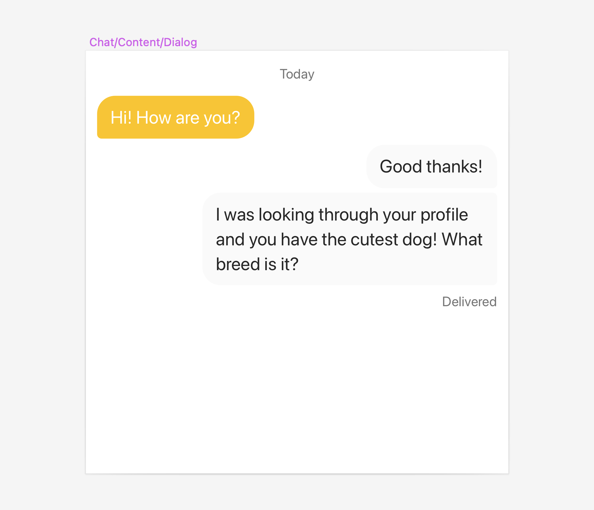
A few variants of the chat message in Badoo
Problem
I sat together with developers to understand the complexities behind the chat component. A great benefit of working at a company like Bumble is that it has a vast archive of learnings available, which helped me to understand the user needs and understand the problem better.
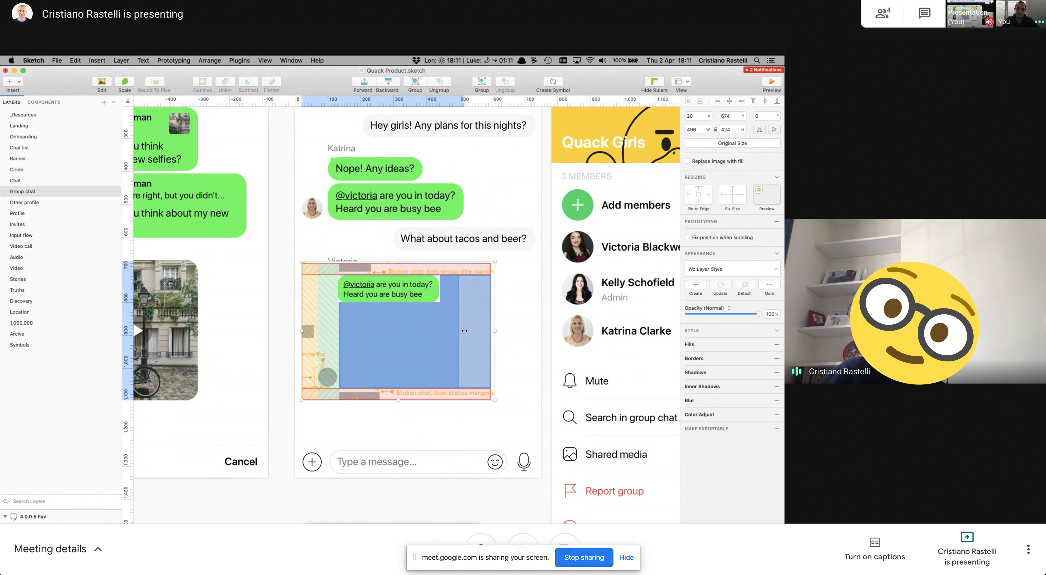
Meeting with developers to understand the chat architecture and how it is built in code
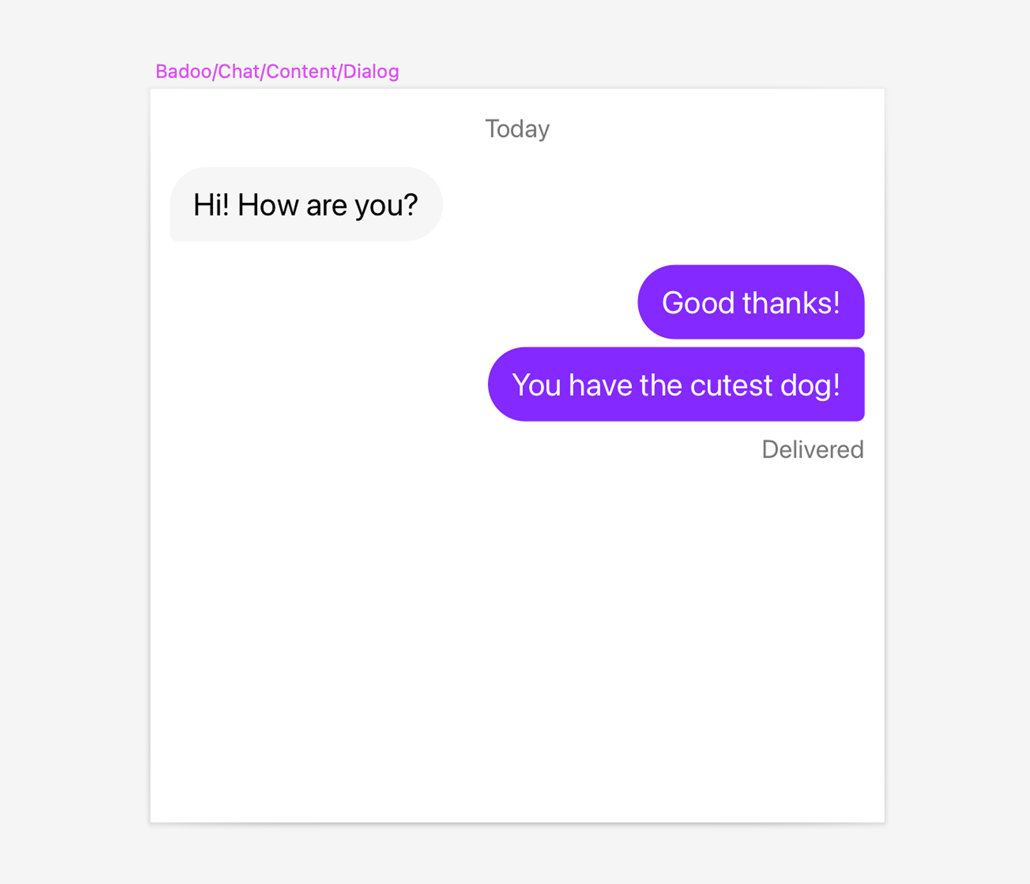
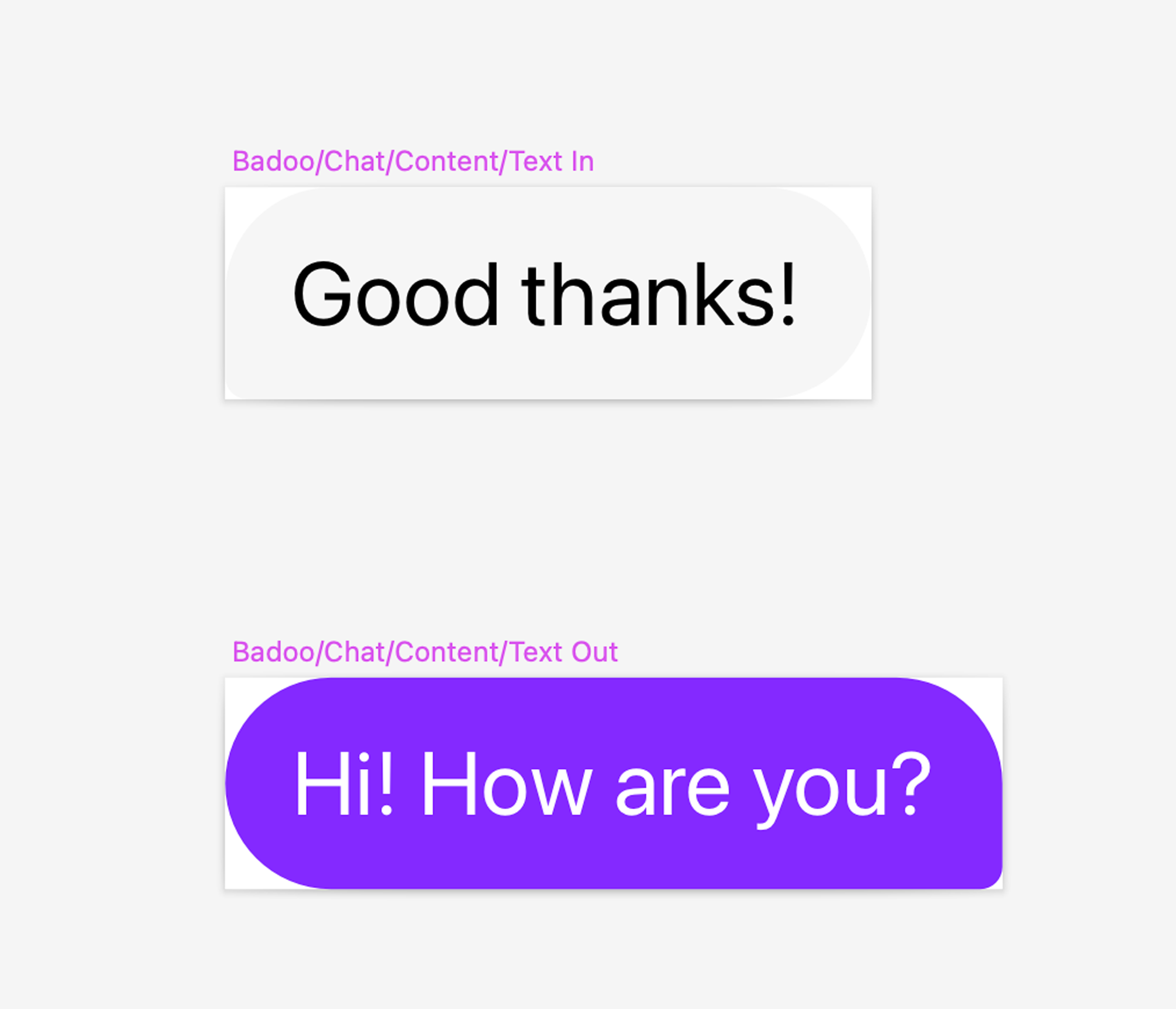
Previously, before migrating to Figma from Sketch, designers only had three main components in the design system. These were the ‘in’ and ‘out’ messages, and a dialog. The reason was that creating 400+ components for the chat is a bit of an overkill and very difficult to maintain.

Due to the lack of variants, designers were coming up with their own components which led to inconsistencies, and obviously, no single source of truth. Since Bumble and Badoo already had the chat component built in Cosmos (Bumble’s design system), I wanted to make sure that everything is following what we have in production and that designers would be able to use the variant they need.
Structure
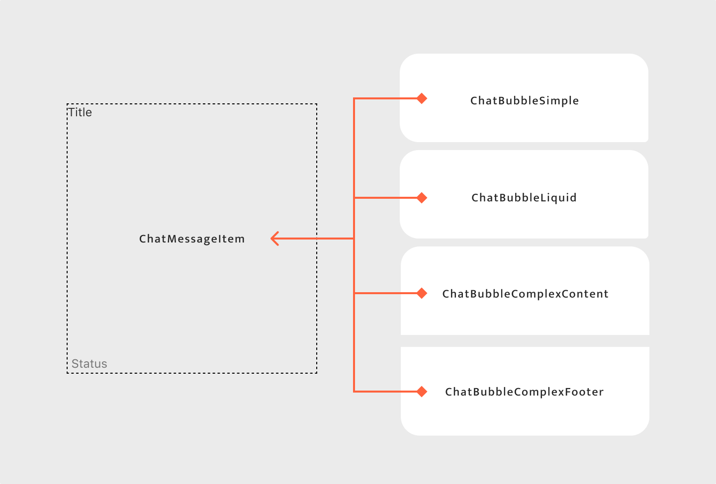
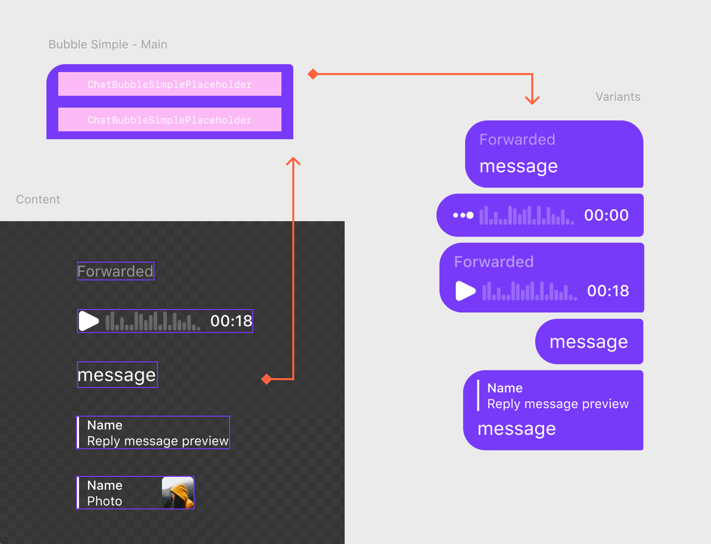
The “chat message” components are built using five main components. These are:
The ‘Chat Message Item’ acts like a container for the other components. In the ‘Chat Message Item’ one will also find the ‘Status’ and the ‘Title’. The reason for this is that all the chat messages can have a status or a title. All the components listed above have a purpose and a different function.
Combining Components
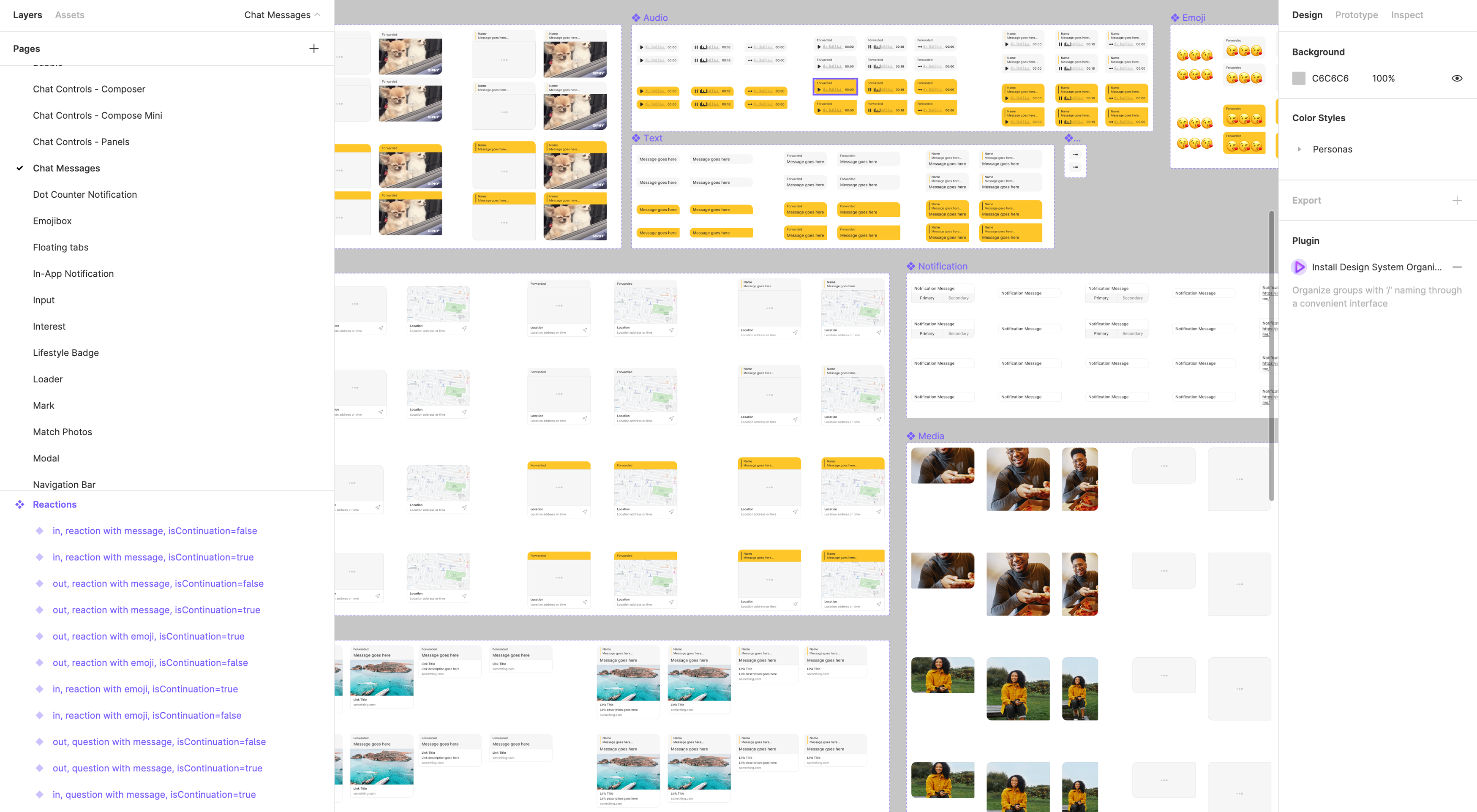
With the help of the main components mentioned above, this allows us to build all the variants of the chat components. The below images illustrate how components are built in Cosmos (development) and how components are nested inside each other.

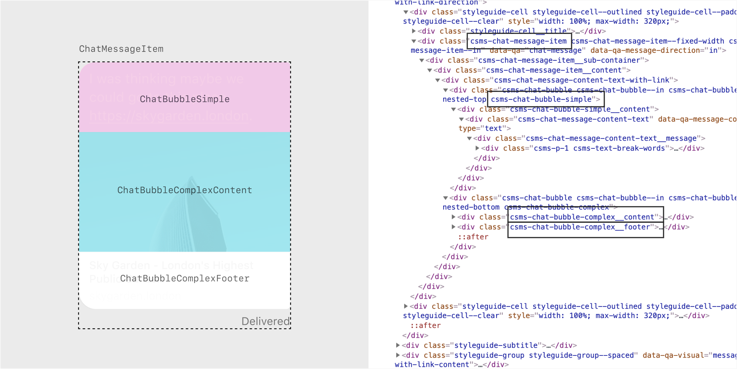
The 'Text with Link' component is built using 3 types of bubbles nested inside the ‘Chat Message Item’
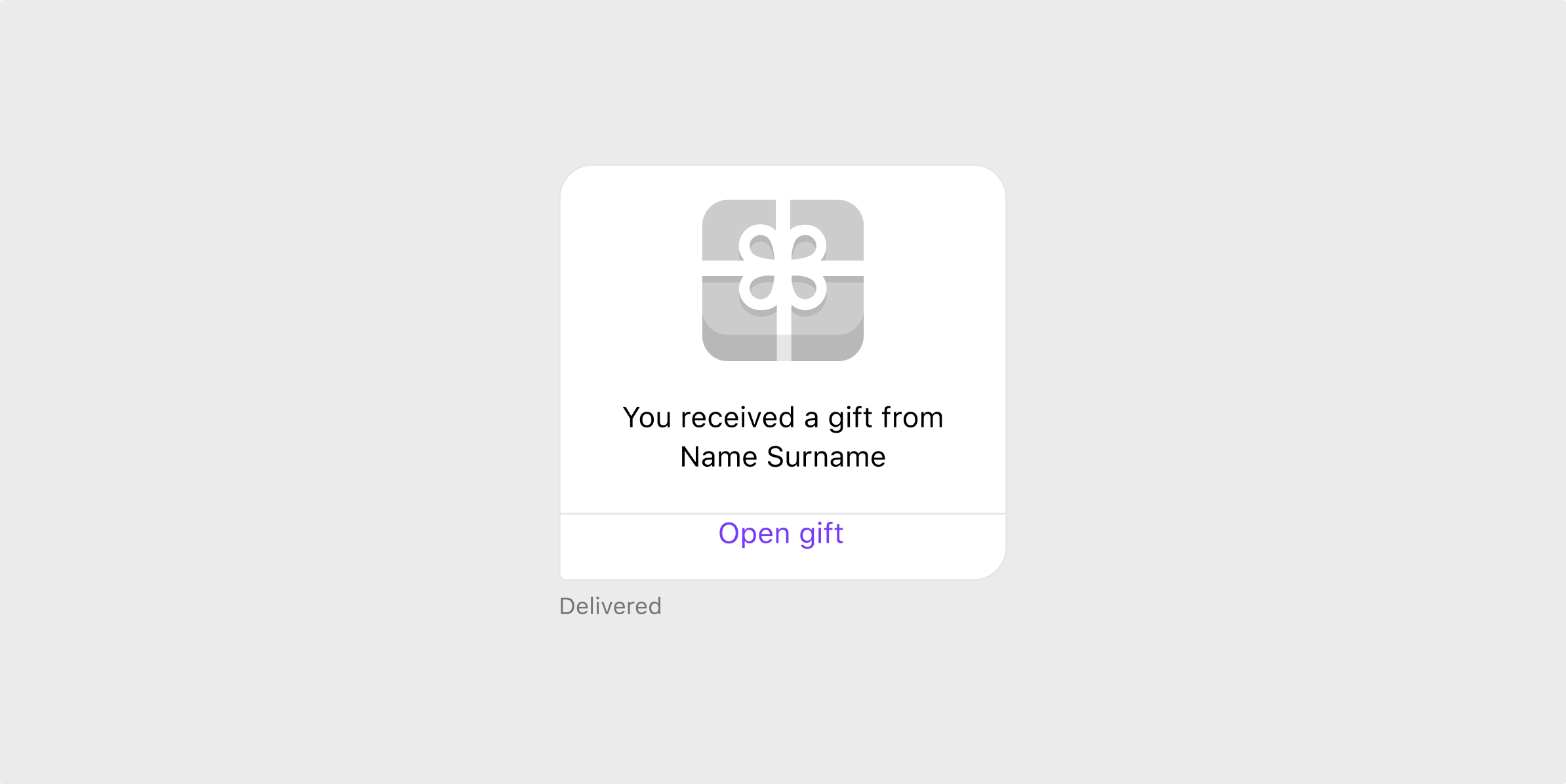

The 'Gift' component is built using 2 types of bubbles nested inside the ‘Chat Message Item’
After going over all the types of messages, I took note of everything including the behaviour and which components each type of message is using. Doing a thorough investigation and research of the components was very helpful to refer to when building components in Figma.
Figma
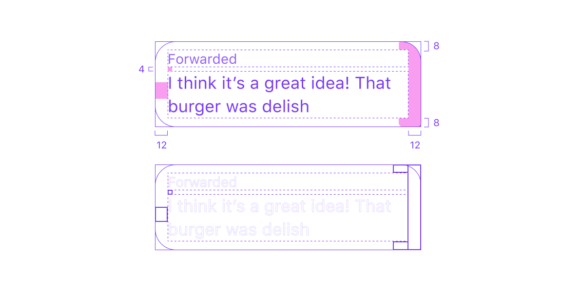
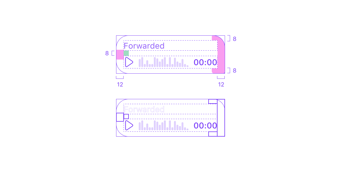
Thanks to the investigation and research, I managed to come up with the same architecture in Figma we have in code. With this architecture, it helped me to create any possible variant of the chat while still maintaining a single source of truth. I used placeholders and auto-layout to build the main components. The placeholders are instances that are used inside the main components to be replaced with other content.
With the placeholder approach, if designers decide to add a new type of message, all we need to do is add a new component in the content group and we can then easily replace the placeholder with the new content. Same goes with updating existing variants, all we have to do is update the components in the content group.
Thanks to auto layout, components are resized automatically and still maintain the same spacing. I also made sure that all message items are using the same token values we have in Cosmos.
Variants
All the chat messages are supporting variants. All properties are in line with what we have in production, and this approach makes the process for designers much quicker.
Some message examples of Badoo and Bumble using the same properties we have in Cosmos
With the help of variants, designers won’t have to browse through 400 components in the library, but all variants are combined to just 13 components.
Badoo Design System. Designers are now able to use all 400 variants with just 13 components from the left panel.
Bumble Design System
Conclusion
All chat messages are now added in Figma and designers won’t have to worry about missing variants. We are still finding, learning, and understanding as we go along. We make sure to keep getting feedback from designers and keep iterating and improving the system to make it a pleasant experience for the consumers.
We didn’t receive any complaints from the designers. When we received requests to update the chat component, we easily updated and added the variations needed. However, since this project was started a couple of months before the release of auto-layout in Figma, we encountered some issues with the updates. Some components were broken and it took me a while to fix all the issues. This was caused due to the complex system that chat is built on. The decision was to make the chat structure much more simpler in Figma when the work on the applications redesign will start.
Having said that, this project allowed us to build more consistently and speak the same language across every part of our products.
Related case study: Migrating from Sketch to Figma
Related case study: Design System in Figma
Lokalise interview: The magic of Figma: use cases you wouldn’t expect
