Introduction
Design X is a design system built in Sketch for a B2B Gaming platform. The project allowed me to explor Framer X and React. The purpose of this project was to create a UI kit that will be used for all future Back Office control panels and for all components that are used for the casinos offered by Global Gaming.
The problem identified was that there was no consistency between products, designers and developers. The solution was to create a library and documentation with all the guidelines and components structure, so that the development team can easily refer to when building new interfaces and components. If no framework is used, the development team will end up using an interim UI kit. This would further increase the inconsistency when building the UI. The goals for this project were to have:
The scope was to replace all back-end and gaming platforms and build them using an atomic structure. Some of the requirements included:
Sketch Files
The sketch files are based on quarks and library of the components. The quarks include all the colours, icons and typography. The components library includes all the components used in the casino and back-office.

Framer
Another task assigned to me was to build the building blocks and components of the system using Framer to enhance the possibilities of interactive design and reusability.
Colors
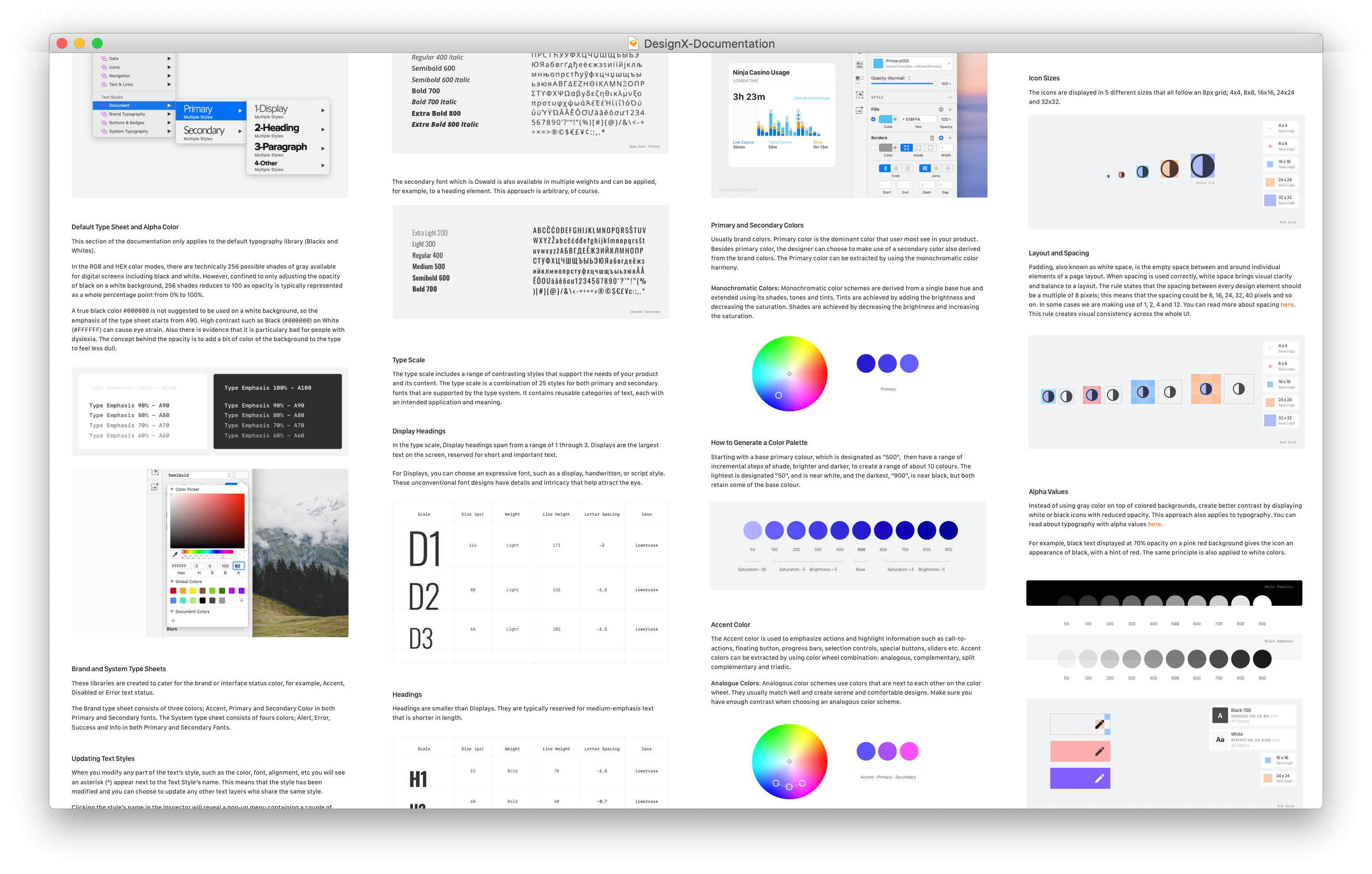
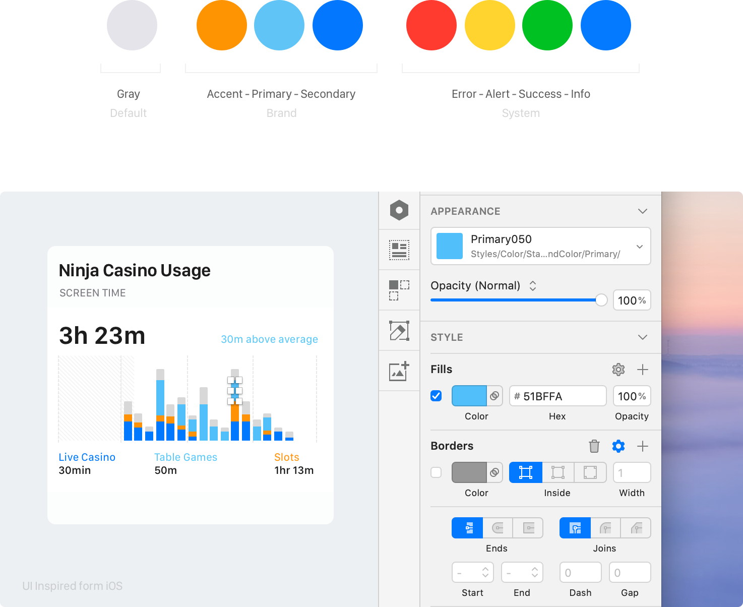
In the Color Libraries one will find 8 different color palettes; Gray, Primary, Secondary, Accent, Alert, Error, Success and Info. The color palettes are grouped in three different sections; Default, Brand and System Colors. The colour palette is using the same method as Material's Design, starting with a base primary colour, which is designated as '500', then have a range of incremental steps of shade, brighter and darker, to create a range of about 10 colours. The lightest is designated '50', and is near white, and the darkest '900', and is near black. Both scales retain some of the base colour. Below is an image representation of how the libraries are structured.
When it comes to react, the process was much easier as a const declaration and different properties were used for all the colours.
Typography
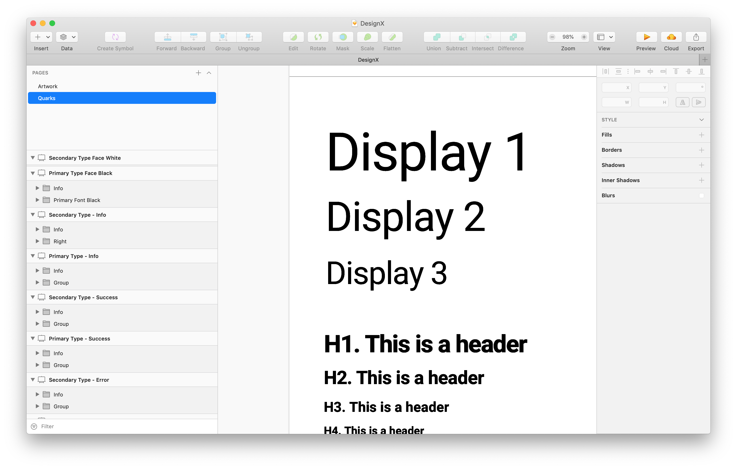
Design X is using a simple font combination organised from H1 to H6 headers and P1 to P6 Paragraphs. The typesheet also includes Displays and other text styles such as Block Quotes, Captions, Small Caps, and Small Text.
Typography system in Sketch is built into shared styles with a simple structure:
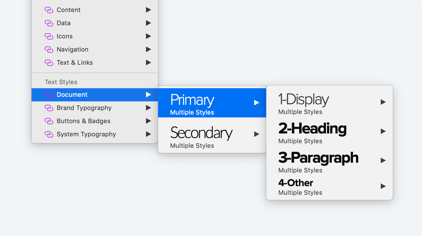
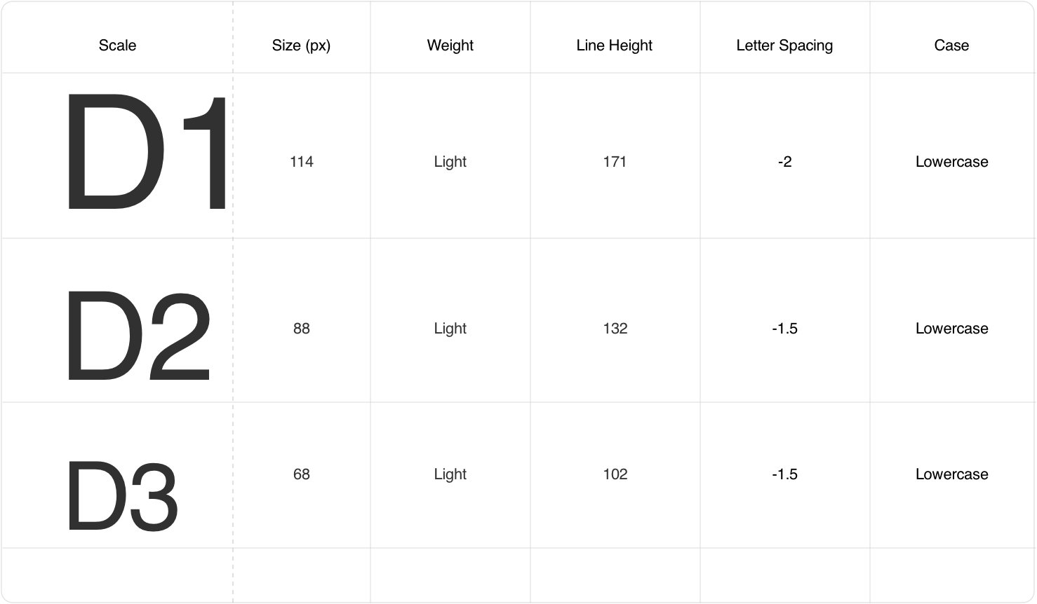
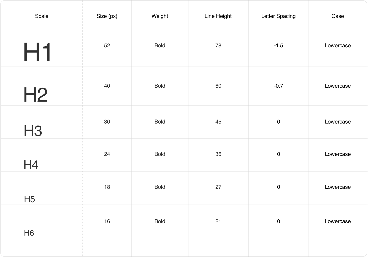
In Sketch, The type scale includes a range of contrasting styles that support the needs of the product and its content. The type scale is a combination of 25 styles for both primary and secondary fonts that are supported by the type system. It contains reusable categories of text, each with an intended application and meaning.
Responsive Type Scale
In Framer, the typesheet is structured a bit different and slightly more advanced. The typescale is extended to be responsive across multiple breakpoints. Another const declaration was used for the breakpoints. The breakpoints set are ‘extra small’, ‘small’, ‘medium’, ‘large’ and ‘extra large’.
The breakpoints value was used to set different font sizes for different type scales. This approach is useful for scaling across a vast spectrum of breakpoint sizes.
Different props were passed in the component for the user to control the text input, type scale, colour, colour scale and alignment. A padding and a margin background were also added to the component so that the user can see the padding and margin set to the text value. These can be toggled on or off from the right panel of framer.
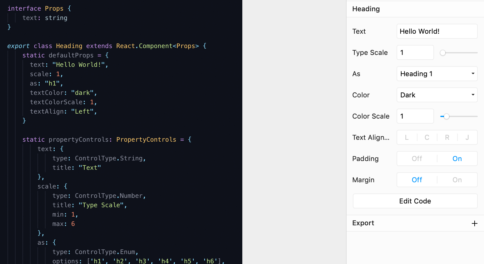
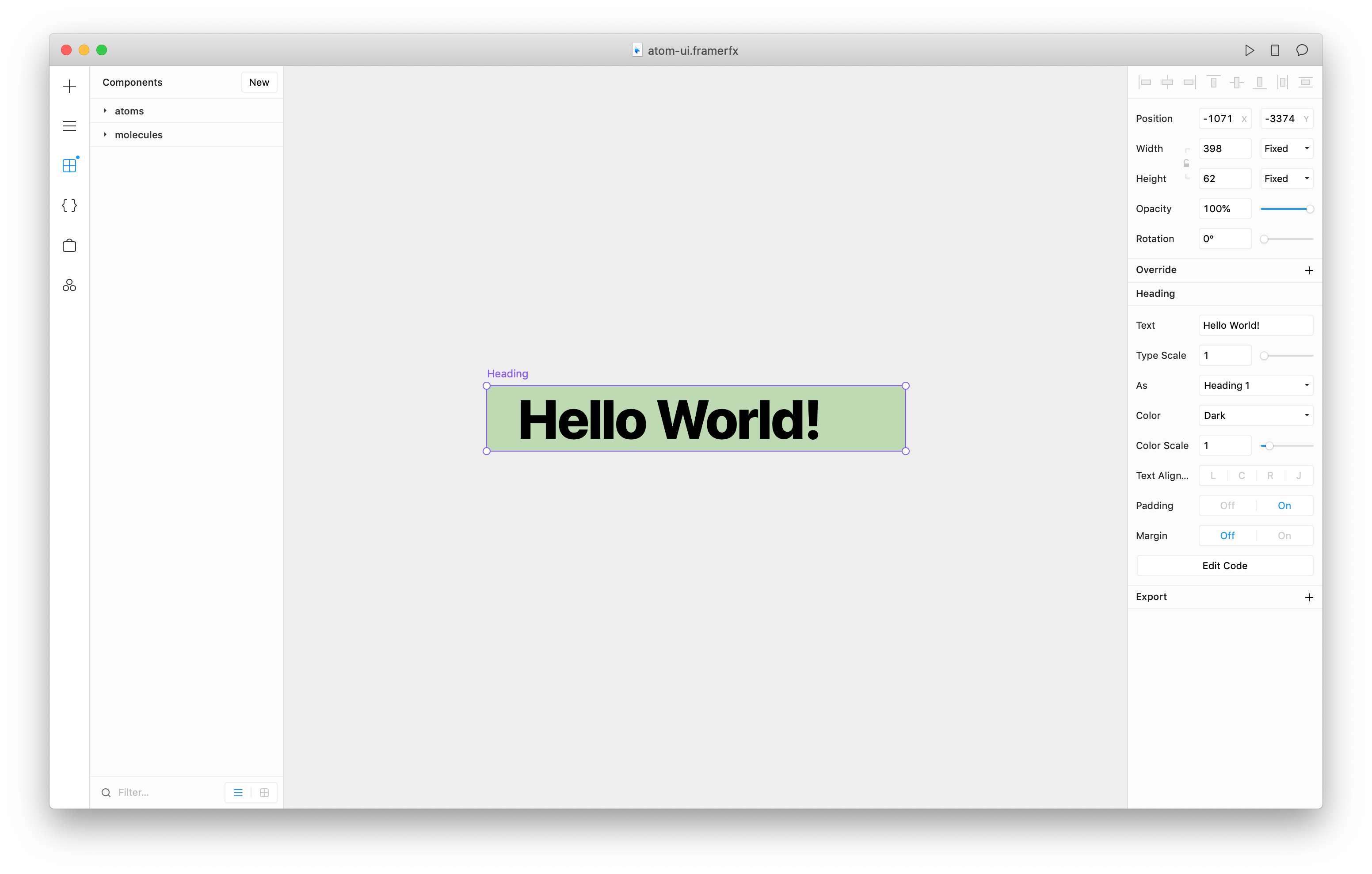
Type Sheet
In total 3 different components were used for the typesheet, display, heading and paragraph. Below is a video showing how a user can set different values to a type component.
Responsive heading - The font size of the heading component is changing per breakpoint.
Shapes
To create the shape component, I had to create other variables such as the radius and shadows. The same approach used for the colours and breakpoints, was applied to the radius and shadows.
For the shadows, the values are very simple varying from 1 to 5. The radius property has 16 values with increments of 2 except for values 18 and 19. A 500rem was used to cater for buttons and other rounded shapes. The 100% value (19) was used to cater for oval shapes.
Documentation
Documentation of all the guidelines and components was documented for better consistency. Documentation is essential as most developers refer to it when they want to learn about a new project, or when they come across an issue. The documentation was very quickly drafted in sketch and uploaded to confluence. Post MVP an inhouse portal will be developed for all the guidelines and documentation.